
CLEVER OR HACKNEYED?
The problem with double-meaning logos
Designers love a clever logo but are double meaning logos clever or hackneyed?
Give us a bit of negative space and we'll find an arrow, a spoon, a cyclist, a dove, a lighting bolt, a number, and, if we're really showing off, probably a hidden message about the company's values too.And I get it.There's something incredibly satisfying about discovering a second idea hiding inside a simple mark.You look at it.You see one thing.On second read, you discover something extra...Oh. I see it.It's a tiny magic trick.But I've started wondering: are double-meaning logos actually good branding, or have we become a little too obsessed with being clever?I'm not talking about the obvious example that gets wheeled out in practically every article about negative space. You know the one.Instead, I want to look at what actually makes this technique work — and when it starts to feel like a designer solving a puzzle simply because they can.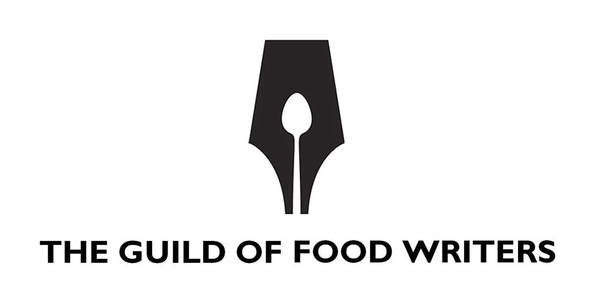
One of my favourite examples is the logo for the Guild of Food Writers.At first glance, it's a classic fountain pen nib.Look a little closer and you'll see the spoon.Food + writing.The two things the organisation is literally about, combined into one incredibly economical idea.The logo was created by London agency 300million in 2005 and has become one of the more celebrated examples of negative-space logo design.And I think this is where the technique is at its best.The cleverness isn't the idea.The idea is the idea.The designer hasn't taken a generic logo and hidden a second object inside it for the sake of making someone say “nice”.The two meanings are genuinely relevant to the brand.That's a big difference.A couple I've made myself
I've used this approach in my own work too.

For Voices for Peace, I used quotation marks as the starting point, a simple visual reference to voices, dialogue and the act of speaking. But within the negative space, the forms create the silhouette of a dove.

So you've got quotation marks + dove = voices + peace.

The idea was to make the symbol feel relevant to both parts of the name without having to illustrate either one literally. The dove isn't sitting next to a speech mark saying “peace”; the two ideas are sharing the same space.

And that's probably the bit I enjoy most about this approach.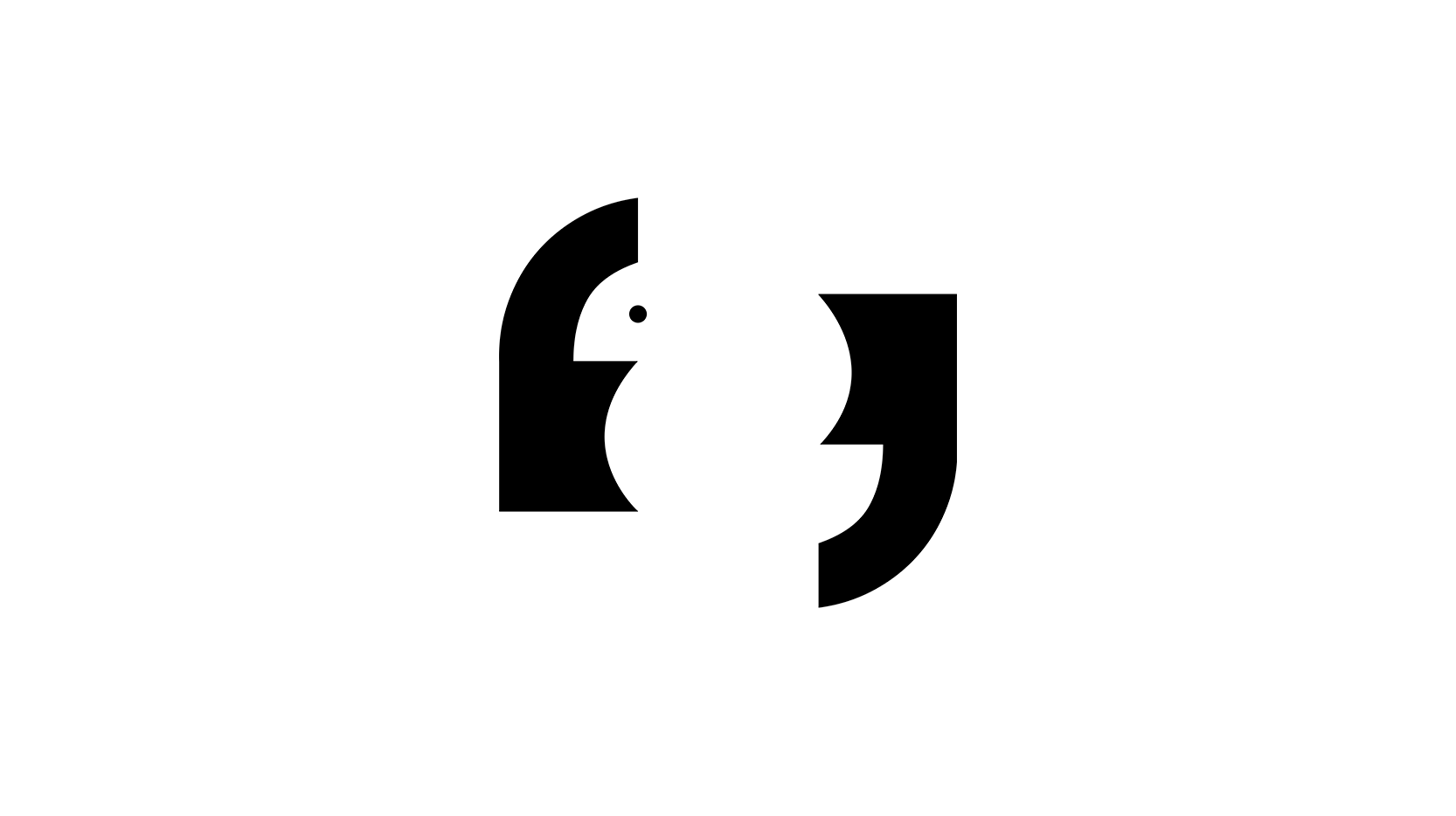
I took a similar route with Fairway Village, the luxury hospitality concept for Wimbledon.
The starting point was actually the Guild of Food Writers logo. I liked the way its spoon and pen nib share a shapes, creating one form from two different ideas.For Fairway Village, I took that principle and applied it to tennis and hospitality.The silhouette of a spoon becomes the outer form, while the lines within it are inspired by the seams of a tennis ball.So you've got first-class service + tennis existing within the same mark.Again, the intention wasn't simply to hide a tennis ball inside a spoon because it looked clever.The two elements were there because they were both fundamental to the proposition: Wimbledon and the sport itself, alongside the hospitality and service surrounding it.That's the distinction I keep coming back to.The trick isn't the clever bit.The relationship between the two ideas is.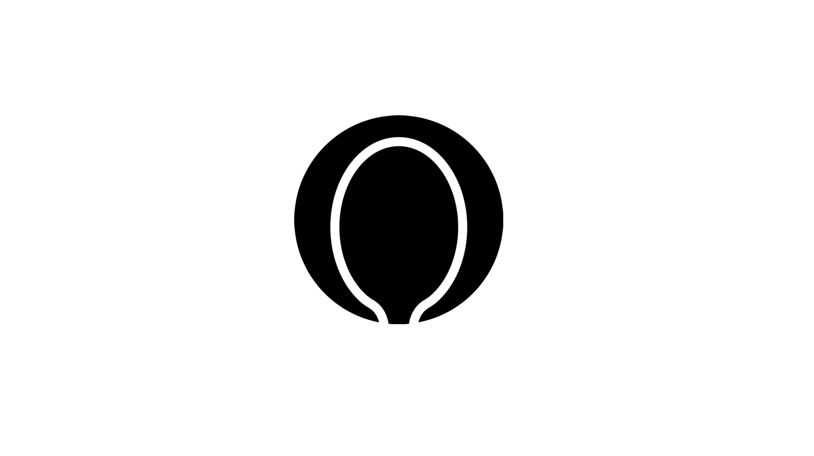
When the second meaning earns its place
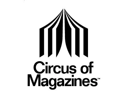
Take Circus of Magazines.

Designed by Olivier Courbet, the logo combines two very different things: an open magazine and a circus tent. The pages of the magazine become the structure of the tent, creating one simple form that manages to communicate both halves of the name.

It's a particularly nice example because the two ideas aren't just hidden inside the mark, they are dependent on each other.

Take away the magazine and you've still got a circus tent.

Take away the tent and you've still got something that looks like the leaves in a publication.

Put them together and suddenly the name makes visual sense.

And importantly, the concept came from the actual challenge: creating a mark for an online marketplace for magazines while incorporating a classic circus feature without falling into obvious circus clichés. The result went on to win WOLDA's overall 2009 award.

That's what I mean by the second meaning earning its place.

It's not:

Magazine + circus = cute.

It's:

Magazine + circus = Circus of Magazines.

The second meaning isn't an Easter egg bolted onto the logo.

It's the reason the logo works.

And perhaps that's the test I'd apply to any double-meaning logo:

Does the second meaning tell me something useful about the brand?

If yes, great.

If not, we're potentially just doing visual party tricks.
Lime although slightly basic, is another interesting case because the idea is less about classic negative space and more about visual association.The brand's bikes use circular forms that can evoke slices of lime, tying the name of the company to the physical product.It's a simple idea.Lime → circle → wheel → bike.You don't need a brand strategist to explain it to you.And that's important.Because one of the great things about a good double meaning is that you shouldn't necessarily need to explain it.You should be able to discover it.The little “aha”
That's probably what makes these logos so appealing.
They're interactive.A normal logo simply presents you with an idea.A good double-meaning logo makes you participate and discover something yourself.There's the first read.Then the second.“Oh… wait.”That little moment of discovery is memorable.But there's a danger here.Because once designers discover how satisfying that moment is, it's very easy to start designing for the reveal rather than designing for the brand.And that's where things can go wrong.When clever becomes the concept
I've seen this happen in presentations.
A logo is revealed.Someone asks:“What's the idea?”And suddenly we're looking at a 45-second animation explaining that the negative space represents one thing, which intersects with another thing, which relates to a third thing, which represents the company's ambition to...Stop.If the logo needs a TED Talk, something has probably gone wrong.A logo doesn't have to communicate the entire business.It doesn't need to contain the company's values, history, proposition, personality, audience, strategy and five-year plan.Sometimes it just needs to be a really good mark.And sometimes the smartest solution is the one that doesn't try to be clever at all.Negative space isn't the same as hidden meaning
I think it's worth separating these things too.
Negative space is simply the space around and between forms.A double-meaning logo is something slightly different: using that space, shape, typography or visual ambiguity to create another interpretation.And that distinction matters.You can have an incredibly effective logo that uses negative space without hiding anything.Equally, you can have a double-meaning logo that doesn't technically rely on negative space at all.The technique is less important than the relationship between the ideas.The best ones don't shout
There's something else I've noticed about the really good examples.
They don't seem contrived or desperate to show you how clever they are.They are usually simple first and clever second.The Guild of Food Writers mark is a good example.You can read it as a simple graphic shape.You notice the pen nib.Then you realise the spoon within the pen, as the spoon naturally fits the negative space of the nib, it works and it's not overtly trying to force 2 shapes together.That's the sweet spotThere's no need for another three layers.This is probably why the technique becomes less effective when designers try to cram multiple hidden messages into one mark.One good idea is usually enough, and logos don't need to communicate every part of the business, they are used to identify.So, are double-meaning logos overused?
Probably.
But I don't think the problem is double meanings themselves.The problem is using 'cleverness' as a substitute for an idea.There's a difference between:“We discovered a really smart way of expressing this brand idea.”
and:“We've made the letter R look like a bird because we needed the logo to have a hidden meaning.”
The first is design.The second is decoration.And I think that's why this particular area of logo design can be slightly dangerous for designers.Because cleverness is incredibly easy to present in a pitch.You can point at the logo and say:“Look!”Everyone in the room understands the trick.It's satisfying.It's award-friendly.It's easy to explain.But that doesn't automatically make it good branding.My test for a double-meaning logo
Whenever I see one, I'd ask five questions:
1. Does the first read work? If I don't see the brand or the primary idea without being told what I'm looking for, that's a problem.2. Is the second meaning relevant? Not vaguely relevant. Actually relevant.3. Does it add something? Does discovering it give me another reason to remember or understand the brand?4. Is it simple? Could I explain the idea in one sentence?5. Would the logo still work if nobody noticed? This might be the most important one.Because the hidden meaning should ideally be a bonus, not a requirement.The little bit of magic
Ultimately, I’m still a fan of them.
There's something brilliant about finding two ideas living inside one simple form.A spoon within a pen nib.An arrow within the EX.A magazine becoming a circus tent.That little moment of discovery is one of the few genuinely playful things a logo can do.But perhaps that's exactly why we should use the technique sparingly.A clever logo isn't automatically a good logo.And a logo doesn't become better simply because we've hidden something inside it.The real skill is knowing whether there's actually something worth hiding in the first place.Because the best double-meaning logos don't make you think:“That's clever.”They make you think:“Ah, of course.”
I guess it's all a matter of interpretation.
P