DMA’s
Creating intrigue through the unknown.

DMA’S have taken a refreshingly analogue approach to launching their fifth studio album, turning the release itself into part of the story.
Rather than revealing the full tracklist upfront, five tracks are currently available on Spotify, while the remaining songs are deliberately blacked out. It’s a simple but effective device: withholding information creates intrigue, gives fans something to speculate about and makes the full album release feel like an event. A countdown to 21 August builds that anticipation further, creating a clear moment for the album to finally reveal itself.‘ferral energy’
The physical and visual expression of the album carries the same spirit. Self-titled simply as DMA’S, the artwork feels deliberately rough, human and unpolished with cut-out analogue typography, dishevelled letterforms and strips of masking tape holding everything in place. It feels less like a polished piece of album artwork and more like something assembled by hand, reinforcing the record’s themes of 'FERRAL ENERGY'
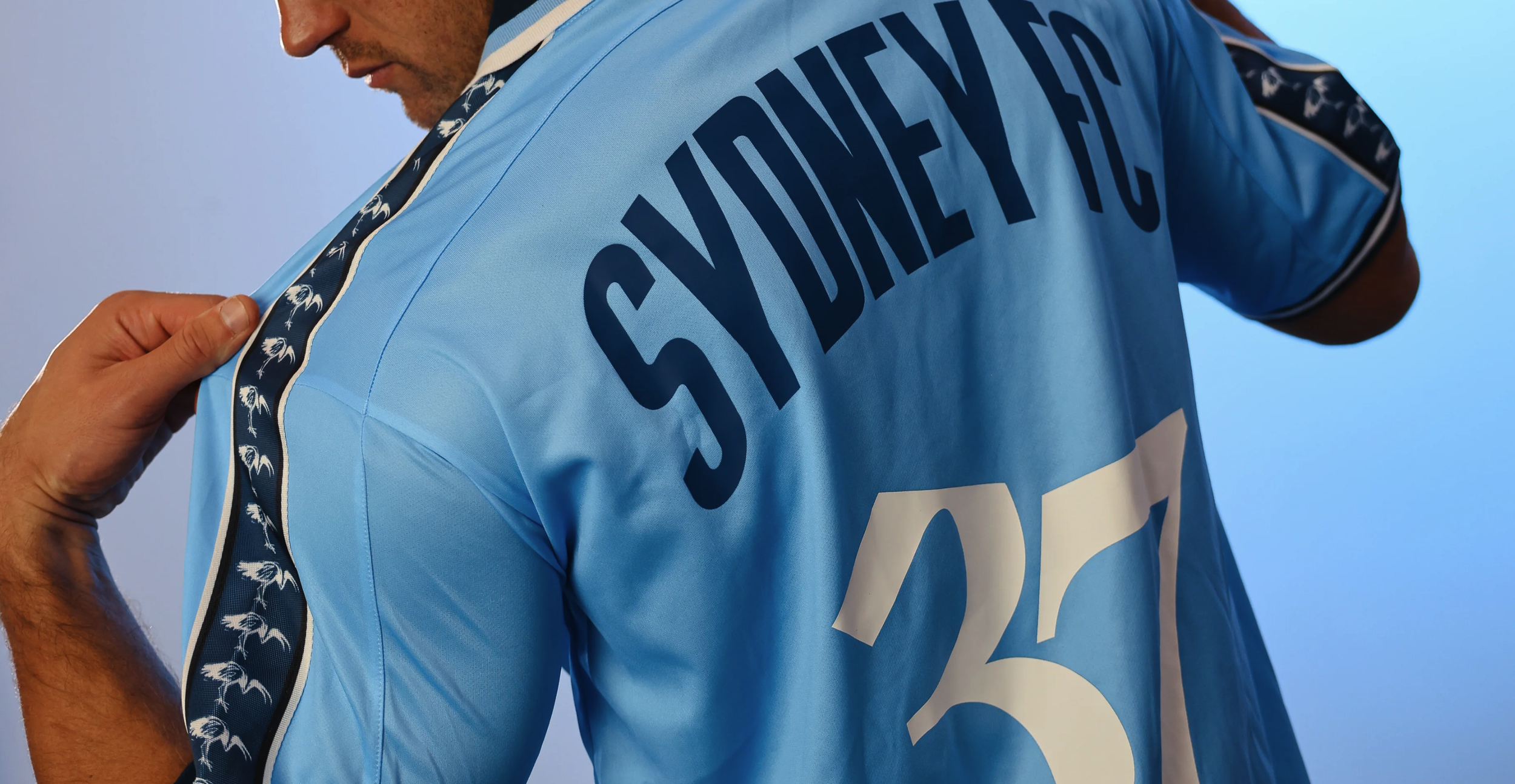
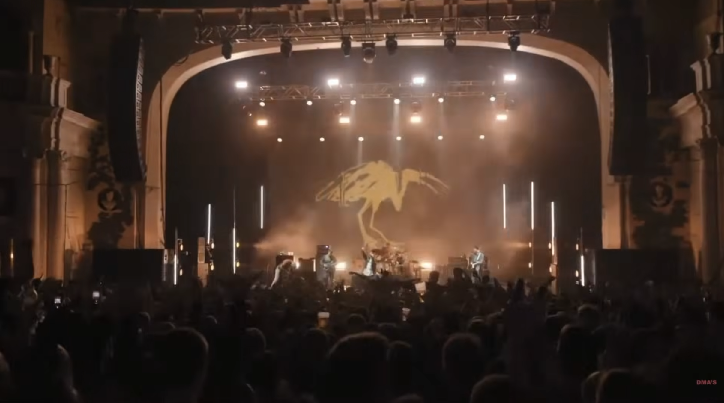
The collaboration with Sydney FC takes that world beyond the album cover and into culture. The limited-edition DMA’S x Sydney FC jersey is more than merchandise; it’s a genuine crossover between two recognisably Sydney institutions. The details make it particularly effective from the ibis motif worked into the sleeves to the 37 on the back, referencing Feels Like 37 from the band's previous album. Those small, considered references reward fans who know the band while still creating a strong, standalone piece of design.
From a marketing perspective, it’s a great example of making a launch feel bigger than the product itself. The music, artwork, digital experience and collaboration all tell the same story: familiar DMA’S, but deliberately less polished, more immediate and a little harder to predict. Instead of simply announcing an album, they've created a series of reasons to pay attention.